The problem
This is the most important page of the website.
It is the most visited page from customers, but something was wrong becouse from data we could see that many people use to leave the page, the conversion rate was really low.
Goals
- Layout and UI review of current page.
- Functions reviews to increase the conversion rate.
The Challenge
- Make clearer the benefits of the iD 'SIMO only' and 'Pay as you go' deals.
- Simplify the opportunity to see on one screen all deals from id mobile: SIMO ans PAYG.
- Simplify the UI design and make it much more intuitive and clear.
- Engage users to buy a iD sim and increase the conversion rate bringing the customers to the basket.
The Solution
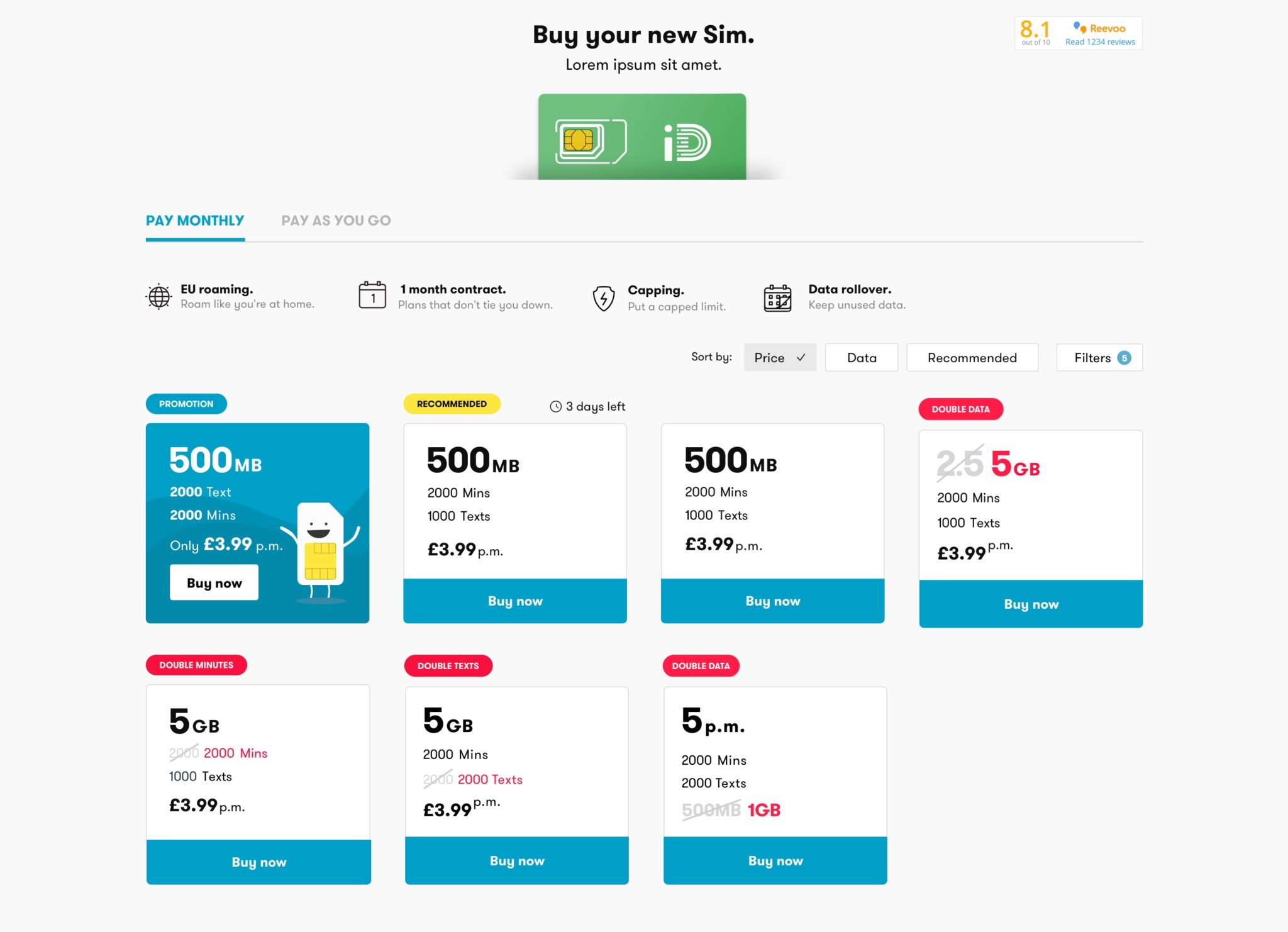
- Show people which is the product that they are going to buy.
- Bring together in same page the 2 options: SIMO only deals and Pay-as-you-go deals to give the customer the opportunity to swich quickly from SIMO to PAY AS YOU GO.
- Move on top all the plans benefits to engage users to buy a iD mobile SIM.
- Simplify the cards UI that show clearer the data, price, minutes and texts.
Mobile first approach becouse more than 60% of customers use mobile.
Add 'Sort by' which is useful for customers who want to prioritise data vs. price
Filters can be a good option if we have more than 10 products.
AS IS SIMO DESKTOP

PAY AS YOU GO DESKTOP

AS IS SIMO MOBILE

The process
Competitor Analysis
BT
https://www.productsandservices.bt.com/mobile/sim-only-deals/
USwitch
https://www.uswitch.com/mobiles/compare/sim_only_deals/
Argos
http://www.argos.co.uk/static/ArgosPromo3/includeName/SIM-only-contracts.htm
Carphone Warehouse
https://www.carphonewarehouse.com/sim-only/pay-monthly.html
Tesco Mobile
https://www.tescomobile.com/shop/tesco-mobile/sim-only/tariff?upfrontCost=0
Low Explorations


Final Version Desktop


Final version mobile


Interested in working together? Get in touch!
Email: isabellaelenacirulli@gmail.com
Linkedin: www.linkedin.com/in/isabella-cirulli
© Isabella Cirulli 2024
Product Designer

